Managing Dashboard Color Palettes
The Administrative task of managing Dashboard Color Palettes is done at the Site Administration Level. This requires a Site Administrator and is not available within the application, as edits to your Dashboard Themes will affect every application in FAST, not only the current application you're working with.
To manage the Dashboard Color Palettes (or Themes)
Access Site Administration from the main FAST Tab Strip; select Layout -> Dashboard Color Palettes
A certain number of default (baseline) Themes have been delivered in your version of FAST. It will look something like this:
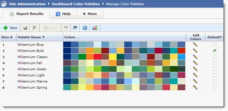
To change your institutional default Theme, change the Default indicator (only one) and click Save.
You can edit any of the existing Themes or re-name them to suit!
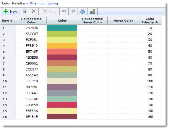
To make edits to an existing palette, click the Edit Pencil. Once in Edit Mode you will see the Theme expanded out by Hexadecimal Color Code:
To add additional Color Palettes for your end users to choose from, click + New and create a new Theme.
To change the Color Priority, simply adjust the numbering sequence. This is the order in which the colors will be used and displayed in your various charts and graphs. Try not to have colors that are too similar running sequentially next to each other for best contrast and visual appeal.
You can also add an optional "Hover Color" which is the color used when end users hover their cursor over a particular segment of chart on the Dashboard. Consider using a lighter or darker shade of the same color for best contrast.
Tip!
Most organizations' Marketing Department will have a list of Hexadecimal Color Codes for your own school colors - feel free to use these in one or more of your Color Palettes!
To find additional codes and color options, just search for "Hex Color Codes" online and you'll find a huge library of codes to choose from! Then just copy and paste the codes into the text field in Edit Mode.